Components
Moon card
The painted moon for the phase angle, the lit percentage and the phase name. Eight artworks are chosen by angle band.
Preview
MOON0%
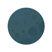
MOON15%
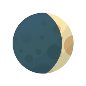
MOON50%
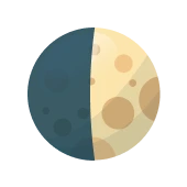
MOON85%
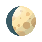
MOON100%
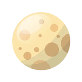
MOON85%
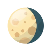
MOON50%
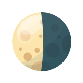
MOON15%
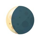
Variants
Pick a variant with the controls. The preview and both code blocks follow.
Cycle
MOON85%
Variant.tsx
<AppMoonCard angle={134} illumination={0.85} />Implementation
The React tab is this site's own component, the same source that draws the preview, styled by the CSS below it. The Flutter tab is the Dart a screen builds it with, from the app's tokens.
Usage
<AppMoonCard angle={135} />app-widgets.tsx · moonPhase
/** The moon artwork and label for a phase angle, with the app's bands (moon_mini_card.dart). */export function moonPhase(angle: number): { asset: string; label: string } {app-widgets.tsx · AppMoonCard
/** MoonMiniCard: the painted moon, illumination and phase name. */export function AppMoonCard({ angle, illumination }: { angle: number; illumination?: number }) { const { asset, label } = moonPhase(angle); const lit = Math.round((illumination ?? (1 - Math.cos((angle * Math.PI) / 180)) / 2) * 100); return ( <div className="app-ui app-card is-mini"> <div className="app-card-head"> <span className="app-label-sm">MOON</span> <span className="app-label-sm" style={{ color: "var(--c-text)" }}>{lit}%</span> </div> <div className="app-moon-body"> {/* eslint-disable-next-line @next/next/no-img-element */} <img className="app-moon-img" src={`/app/${asset}.webp`} alt={label} /> </div> <span className="app-label-md app-moon-name">{label}</span> </div> );}app-ui.css
.app-card { position: relative; box-sizing: border-box; display: flex; flex-direction: column; padding: var(--spacing-f13); border-radius: var(--radius-f21); border: var(--spacing-f1) solid var(--hair-strong); background: var(--sheen), var(--fill); box-shadow: var(--highlight); backdrop-filter: blur(var(--spacing-f13)); overflow: hidden;}.app-card.is-mini { width: var(--spacing-f144); height: calc(var(--spacing-f144) + var(--spacing-f21)); flex: none; }.app-card-head { display: flex; justify-content: space-between; align-items: center; gap: var(--spacing-f8); }.app-moon-body { flex: 1; display: grid; place-items: center; }.app-moon-img { width: var(--spacing-f89); height: var(--spacing-f89); object-fit: contain; }Usage
MoonMiniCard(moonPhaseInfo: MoonPhaseInfo(phaseAngle: 135, illumination: 0.85),)astr_glass.dart · AstrGlassCard
/// The glass surface for cards: a sheen over the surface and a hairline edge./// Cards do not glow; glow belongs to buttons and tiles. Mini cards are/// [AstrSpace.f144] wide and 144 + 21 tall.class AstrGlassCard extends StatelessWidget { const AstrGlassCard({ super.key, required this.child, this.width, this.height, }); final Widget child; final double? width; final double? height; @override Widget build(BuildContext context) { final Color text = AstrColors.spaceGrey[50]!; final BorderRadius radius = BorderRadius.circular(AstrRadius.f21); return RepaintBoundary( child: ClipRRect( borderRadius: radius, child: BackdropFilter( filter: ImageFilter.blur(sigmaX: AstrSpace.f13, sigmaY: AstrSpace.f13), child: Container( width: width, height: height, padding: const EdgeInsets.all(AstrSpace.f13), decoration: BoxDecoration( borderRadius: radius, border: Border.all(color: text.withValues(alpha: Mag.m5)), color: _ink.withValues(alpha: Mag.m1), gradient: LinearGradient( begin: Alignment.topLeft, end: Alignment.bottomRight, colors: <Color>[ text.withValues(alpha: Mag.m5), text.withValues(alpha: Mag.m8), ], ), ), child: child, ), ), ), ); }}moon_mini_card.dart · MoonMiniCard
class MoonMiniCard extends StatelessWidget { const MoonMiniCard({ super.key, required this.moonPhaseInfo, }); final MoonPhaseInfo moonPhaseInfo; @override Widget build(BuildContext context) { final String moonAsset = _getMoonAsset(moonPhaseInfo); final String moonPhaseLabel = _getMoonPhaseLabel(moonPhaseInfo); final int illuminationPercent = (moonPhaseInfo.illumination * 100).round(); return GestureDetector( onTap: () { showModalBottomSheet<void>( context: context, backgroundColor: Colors.transparent, isScrollControlled: true, builder: (BuildContext ctx) => CelestialDetailSheet( objectId: 'moon', title: 'Moon', subtitle: moonPhaseLabel, ), ); }, child: RepaintBoundary( child: ClipRRect( borderRadius: BorderRadius.circular(AppSpacing.kCardRadius), child: BackdropFilter( filter: ImageFilter.blur(sigmaX: 2, sigmaY: 2), child: Container( width: AppSpacing.kMiniCardWidth, height: AppSpacing.kMiniCardHeight, decoration: BoxDecoration( color: AppColors.surfaceOverlay, border: Border.all(color: AppColors.borderPrimary), borderRadius: BorderRadius.circular(AppSpacing.kCardRadius), ), child: Stack( children: <Widget>[ Positioned( top: 15, left: 15, child: Text( 'MOON', style: AppTypography.labelSm.copyWith(color: AppColors.textMuted), ), ), Positioned( top: 15, right: 15, child: Text( '$illuminationPercent%', style: AppTypography.labelSm.copyWith(color: AppColors.textPrimary), ), ), Positioned( top: 32, left: 33, width: 98, height: 92, child: Image.asset( moonAsset, fit: BoxFit.contain, ), ), Positioned( bottom: 15, left: 0, right: 0, child: Center( child: Text( moonPhaseLabel, style: AppTypography.labelMd.copyWith(color: AppColors.textPrimary), ), ), ), ], ), ), ), ), ), ); } static String _getMoonAsset(MoonPhaseInfo info) { final double angle = info.phaseAngle; if (angle >= 355 || angle <= 5) return 'assets/img/moon_new.webp'; if (angle > 5 && angle < 85) return 'assets/img/moon_waxing_crescent.webp'; if (angle >= 85 && angle <= 95) return 'assets/img/moon_first_quarter.webp'; if (angle > 95 && angle < 175) return 'assets/img/moon_waxing_gibbous.webp'; if (angle >= 175 && angle <= 185) return 'assets/img/moon_full.webp'; if (angle > 185 && angle < 265) return 'assets/img/moon_waning_gibbous.webp'; if (angle >= 265 && angle <= 275) return 'assets/img/moon_last_quarter.webp'; if (angle > 275 && angle < 355) return 'assets/img/moon_waning_crescent.webp'; return 'assets/img/moon_waning_gibbous.webp'; } static String _getMoonPhaseLabel(MoonPhaseInfo info) { final double angle = info.phaseAngle; if (angle >= 355 || angle <= 5) return 'New Moon'; if (angle > 5 && angle < 85) return 'Waxing Crescent'; if (angle >= 85 && angle <= 95) return 'First Quarter'; if (angle > 95 && angle < 175) return 'Waxing Gibbous'; if (angle >= 175 && angle <= 185) return 'Full Moon'; if (angle > 185 && angle < 265) return 'Waning Gibbous'; if (angle >= 265 && angle <= 275) return 'Last Quarter'; if (angle > 275 && angle < 355) return 'Waning Crescent'; return 'Moon'; }}API reference
| React prop | Flutter parameter | Type | Default | Meaning |
|---|---|---|---|---|
| angle | moonPhaseInfo.phaseAngle | degrees | required | 0 new, 180 full. |
| illumination | moonPhaseInfo.illumination | 0 to 1 | derived | The lit share. Without it the web card computes (1 − cos angle) / 2; the app passes the ephemeris value. |
Design tokens
Every value on this component is a system token. The last column is what the app widget uses today, so the gap to close is visible.
| Role | CSS token | Dart token | App widget today |
|---|---|---|---|
| Size | --spacing-f144 by 144 + --spacing-f21 | AstrSpace.f144 | 164 by 154 |
| Artwork | --spacing-f89 square | AstrSpace.f89 | 98 by 92 |
| Name | --text-s-1 | AstrType.sNeg1 | labelMd 12 |
| Caption | --text-s-2 | AstrType.sNeg2 | labelSm 10 |
| Surface | glass card | AstrGlassCard | surfaceOverlay + borderPrimary |